
Thursday, 9 January 2014
Draft Contents Page

Monday, 25 November 2013

Tuesday, 12 November 2013
Final Front Cover Draft

This above is my first design of my final music magazine front cover. The things I feel like I need to improve on is the font style and my font colouring. My reasons behind this is because I think that my font styles and colours are not following conventions from other magazines from the same genres. I feel like the font does not look professional enough to be seen for example on to be stall stands. On the other hand the way I have presented the text on my front cover I am pleased with as it does follow the conventions of a front cover magazine, so from this I will aim not to change the set out of my text. I have placed my barcode and the rest of the necessary information on the bottom right hand corner. If you look through a lot of magazines you will find that they are placed there. I have placed it there so people know where to find the prices. I have placed the text above my masthead and this is called a skyline. This will attract the audience as it engages the reader by them seeing that it is the worlds best dance magazine.
Thursday, 24 October 2013
Colour Scheme and Font Collage

Wednesday, 23 October 2013
Final Flat Plan

I have changed changed my magazine name from 'Kosher' to 'Bosher'. The reason in this is that I found out that kosher is related to Jews and Jewish meat, so from this I found it inappropriate to have this as my masthead. I have placed the masthead there because it is most effective if it at least 1/5 of the page. Able enough to grab the audiences attention and make them pick up this magazine rather than any other magazine. I have placed a skyline on my front cover because in my opinion it adds to the selling point of the magazine as when people will see it, they will think to themselves that this is a brilliant magazine and will persuade them upon purchase. Therefore I would be making more sales. The target audience would find this eye catching and appealing. The main image I have drawn up is basically the same image as the image I used in my proposal. The photo of Kid Cudi smoking whist not having direct gaze with the reader. With not having direct gaze with the reader this lets the reader think to themselves what are they hiding. Makes them want to read on and that is what you want from a front cover. In this photo the key prop will be the cigarette. Since he is smoking, smoking not only is related to dance music but when a artist smokes they are automatically given the 'bad boy' label. And a lot of music dance artists like to have the bad boy label. Makes them different from the rest of the artists in the world. So in a sense this sort of thing relates to indie music. The sell lines are placed to the right hand side of the main image. The reason for this is that this is where sell lines are most effective in my opinion. Just placed in the middle of the front cover so the reader is bound to see them, and if the main article doesnt persaude the audience to buy the magazine. A sell line will placed in the correct place and have a good content.

This is the final flat plan for my real music magazine, Bosher.
And this is the contents page. The main image you see on the right hand side is taken up nearly one half of the page. The reason behind this is that this will be one of my other articles and the person that I take a close up of will be pulling a blank expression, no smiling or posing. Just staring at the camera and having direct gaze with it. Therefore when the audience looks upon this it will engage the reader into wanting to expand on that certain article. I do not have the headline above the image because I want all that space to be that certain person and only him in that. No words, I think that this will make the image more effective. I do not have the issue date and the issue number on the contents page as I think that they are more effective and not needed when they are already on the front cover. I have placed the contents title in the same place as the masthead on the front cover. I have done this becasue people will know what page they are on and where to find the articles they want to read. I have the subheadings 'Exclusive', 'Regular Features' and 'This week only' and people will be able with this, to again locate where the articles are and it will make it easier and faster to get around my magazine.
Sunday, 20 October 2013
Second Attempt Front Cover

Friday, 18 October 2013
Considerable Photographical Images
I feel like this photo will be a good photo to be on my front cover and the reason for this is that since my music magazine's target audience majority of them is male and students.
 |
| This is what could have been in for my front cover images. In fact these images maybe are more suitable for my front cover compared to the half naked female. |


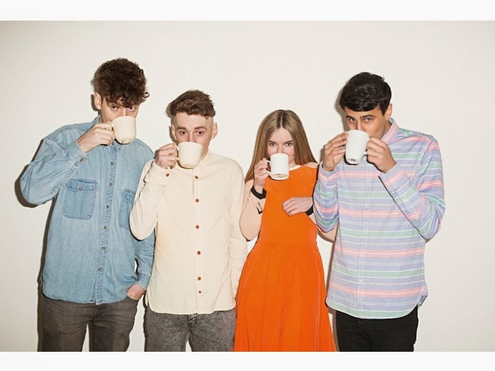 This photo above and below are ones that are in contention to part of my contents page, although I could have them both on my contents page but the only problem in doing this is having them both smaller and that means that the readers will have to go into more depth so that they can see them clearly. I feel like if a picture is bigger it is ,in theory, more productive. The dress sense on the group below Clean Bandit, follows the conventions of my dress sense code in my magazine. Although the group above, Chase and Status, do not wear exactly the dress sense code for my magazine, which is young and fashionable, Chase is wearing a Fred Perry polo top which does link in with my code. In the photo of Clean Bandit they all have direct gaze with the audience, this shows that they have confidence and shows one part of the two paradoxes where the audiecne feels like they can connect with the artists. Chase and Status have direct gaze with the reader as well so the conventions are the same as Clean Bandit's.

Subscribe to:
Posts (Atom)