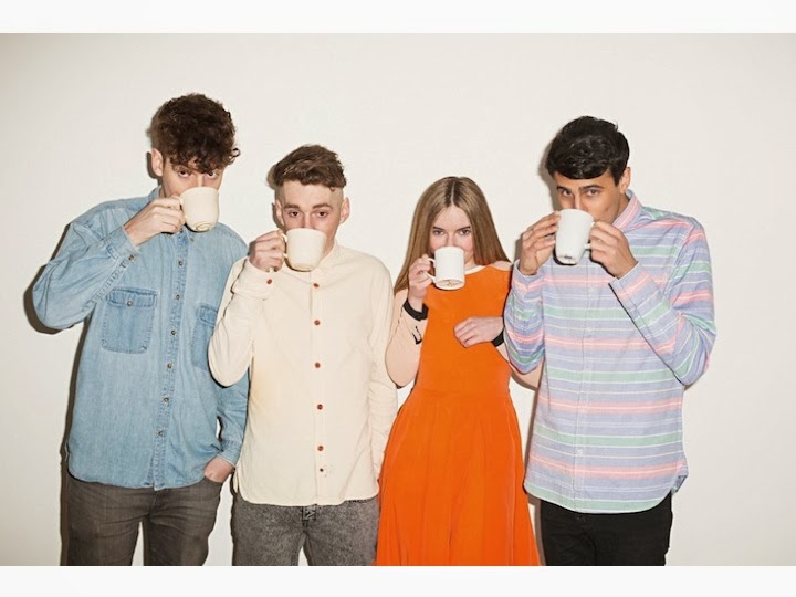
I feel like this photo will be a good photo to be on my front cover and the reason for this is that since my music magazine's target audience majority of them is male and students.
 |
| This is what could have been in for my front cover images. In fact these images maybe are more suitable for my front cover compared to the half naked female. |
 This photo above and below are ones that are in contention to part of my contents page, although I could have them both on my contents page but the only problem in doing this is having them both smaller and that means that the readers will have to go into more depth so that they can see them clearly. I feel like if a picture is bigger it is ,in theory, more productive. The dress sense on the group below Clean Bandit, follows the conventions of my dress sense code in my magazine. Although the group above, Chase and Status, do not wear exactly the dress sense code for my magazine, which is young and fashionable, Chase is wearing a Fred Perry polo top which does link in with my code. In the photo of Clean Bandit they all have direct gaze with the audience, this shows that they have confidence and shows one part of the two paradoxes where the audiecne feels like they can connect with the artists. Chase and Status have direct gaze with the reader as well so the conventions are the same as Clean Bandit's.


No comments:
Post a Comment